Bent + YouAR: Transformation in Action

Bent Image Lab logoWhen does a veteran animation studio become a tech startup? When it’s Bent.

Bent Image Lab in Portland has always been a little unusual. Founders David Daniels, Chel White, and Ray DiCarlo were in the business of animation as a service, but were artists in their own right, and wanted Bent to be more than a business: they wanted to create work that inspires.

Over the years, that vision to express, inspire, and transform has led the company to take on a broad array of projects, branching out from their basis in television commercials to work in film, books and graphic novels, and even a 4D theme park attraction.

A few years ago, the company founded YouAR, a unique augmented reality platform. The technology currently has 7 patents pending in the US, Europe, and China, and will soon release their first SDK.

I have known the team at BENT for a while, and was curious about what drives seasoned veterans to start all over in a new industry, and why, if they were interested in working creatively in AR, they didn’t just use the tools that are out there, but decided to reinvent the platform itself.

So I recently caught up with Ray DiCarlo, to talk about this unexpected addition to Bent’s portfolio.
YouAR logoWhy did Bent start YouAR?

Firstly, the business of being a service studio has changed since 2002 when the company was founded. Advertising budgets were slashed in 2008 (as everyone in the industry remembers all too well), and they aren’t ever going back. And Ray pointed out an interesting aspect of the recession that I hadn’t considered before: the loss of human capital. When companies laid off seasoned, experienced people and replaced them with new, cheaper ones, not only did the new people not know the business, but the relationships were lost. The long-standing exchanges of doing someone a favor sometimes, knowing that they will remember it and return it in the future, were an investment that couldn’t pay off with new staff, in a new climate. Some relationships were lost forever.

And BENT reacted to the recession the way a lot of studios did: expanded service offerings, produced original content, worked directly with clients and branched out of the agency model, but they were also creatively adventurous, wanting to explore something new.

Always on a creative journey, they became interested in augmented reality, in the new and unique experiences that the technology enabled. But David and Ray come from a grounding in art and film, and found the tools hopelessly inadequate for the kind of experiences that they wanted to create. They wanted AR that would work on any device, anywhere, and create realistic, immersive, shared experiences. The tools they wanted didn’t exist, so they decided to make them themselves. As Ray says, “We didn’t want to be a tech company. We wanted to inspire people, to do cool things, and none of the tools were up to our standard.”

It was a huge risk, and an even bigger risk to stay focused on the platform, rather than simply creating AR content. But they are guided by a mission that would allow everyone to create content, and allow everyone to experience it, as intended, on any device.

When I ask why, Ray shares something truly profound:

When money isn’t your main goal in life, you often do things that people don’t understand.

So the partners straddle the line: on the one hand, legends in an industry in which most people don’t last for long: on the other, unlikely newcomers looking for venture capital.

My lifelong fascination with animation stems from a fascination with not just what things are, but in how they change. And in this endeavor, the partners at BENT have undertaken a radical transformation. I am deeply intrigued by the work and the thought process behind it, and am already inspired, looking forward to what Bent and YouAR will achieve in the future.

Featured photo by Rodion Kutsaev on Unsplash

Brilliant Branded Content: The Fearless

Many years ago, an animation professor told me (and I think he is right):

Never animate characters doing sports or athletic stuff. All the drama of watching that is from watching real people and wondering if they will be able to do it. There’s nothing compelling in watching an animated character do it.

But then just LOOK at this spot!

BBC Winter Olympics – The Fearless are Here from Nexus Studios on Vimeo.

The Challenge:

  • The Winter Olympics are an institution. While many people are passionately engaged in them, it’s also difficult to bring a new creative approach to such an established property
  • Most conventional advertising and promotion for sporting events tries to build drama by creating rivalries. As an American, I imagine Bob Costas, year after year, showing highlights of previous competition and dramatizing the stakes in every event. But that approach is best executed in video, with highlight reels and podium shots, and creates drama based on the potential outcome of the event.
  • The BBC has an established history of using animation in their Olympic ads, so additional pressure was on Nexus Studios to be even more creative, doing something that hasn’t been done before even within their medium.

The Execution:

  • Instead of focusing on the drama of the outcome, the who-will-win narrative best told in video, Y&R and Nexus chose to focus on the drama of the moment, of the athlete competing against themselves. Telling a story about internal conflict opened up new possibilities for abstract and creative visualization not generally seen in Olympic ads.
  • 2D animation was a bold choice and, I think, the right one. Not only does it create the opportunity for a striking, graphic style and the creative freedom to depart from reality, but it also (wisely) avoids the uncanny valley we can see in other BBC Olympic ads executed in 3D.
  • The spot has excellent craftsmanship in every frame. The music is perfect; married brilliantly with the visuals and building tension and drama throughout the spot. Working in an abstracted, 2D world allows for rich and powerful visual metaphors: time and speed become smoke and monsters, goals and risk become action lines and dynamic shapes… the freedom to play with and transform shape and scale makes the spot incredibly dynamic. And LOVE that VR camera! It’s the camera that is a technical tour-de-force here, because the choice of 2D as a medium can often limit camera decisions. In this spot, the camera is as free as the characters are, and gives a performance of its own.

The Results:

Everyone is talking about this spot, and it’s abuzz in the ad industry, and it has definitely raised the bar for subsequent BBC Olympic ads.

Of course, I would love to know if the ad creates new opportunities for Nexus and directors Smith & Foulkes. A project like this is a great way to prove technical expertise and creative excellence, and it’s a very smart way to leverage their work in AR and VR to show how those capabilities enhance a traditional creative.

Bonus comparison:

Here are some earlier BBC Olympic adverts:

You will notice that they are all quite good, but all quite similar:

  • beautiful fantasy lighting
  • beautiful, outscale landscapes and scenery
  • great music
  • they all have the same timing: they do a slow build (in story, music, edits, camera) to create drama
  • they all have the very same failing that I mentioned at the top of this article: while really well-designed and well animated, the character animation simply can’t measure up to the level of engagement we would have if we saw a person. The human eye is extremely sensitive to other people, and in video footage we would notice hundreds of microexpressions, the slightest tremor of a muscle or bead of sweat, the tempo of the breath… we are biologically attuned to receive those messages and respond in kind, our own excitement generated by what we are seeing. And we can’t get that innate, human response (maybe we will someday) from animated characters.

Nexus wisely and boldly chose to abandon this path and give us a spot that is adrenaline from beginning to end, and avoided the uncanny valley mis-step in the process. Really fantastic work.

Case Study: Studio Buck’s Metamorphosis

Studio Buck logo

A few years back, Ryan Honey from Studio Buck spoke at Klik Animation Festival, and his talk was incredibly meaningful and transformative for me.

As he told it, Buck was a successful studio, doing well financially, but not really being as creative and ground-breaking as they wanted to be. They had a good reputation and a solid base of commercial clients, but felt like the work was a bit safe, a bit repetitive, a bit stale.

They were approached and asked to do a promo for a non-profit, and they agreed. Because the client wasn’t paying their normal rate, the client agreed to allow the studio to have creative control of the project. They took the creative challenge and ran with it, and this was the result:

Good Books – Metamorphosis from Buck on Vimeo.

Because Good Books is a non-profit, they were able to get a lot of exposure for the spot, and promoted it widely. It won a lot of awards (as we can see in the thumbnail), and Buck started to get calls from a whole new type of client. They started to hear from people who loved that spot, and wanted more of it.

I love everything about this approach and this result. It’s a brilliant approach to creative burnout, and a strikingly effective way to connect with the clients and the projects that are closer to your vision.

Firstly, what a creative and technical tour-de-force. Brilliantly conceived and impeccably executed, every frame of this spot is extraordinary. It might be tempting, if there’s no money involved, to bury the work; devote less time to it than to paid projects, keep your best people working on your core business, and drag your feet a little. Buck obviously did the opposite; they gave this spot everything they had, and celebrated every moment of it.

Secondly, it’s an incredibly clever strategic approach. Swapping creative control for money is a time-honored tradition, but many clients (even non-profits) don’t love it. But it’s also the most powerful and persuasive way to get these kinds of projects realized.

Finally, non-profits do have some advantages when it comes to distribution and visibility, because the work isn’t commercial as such. They are often able to secure slightly preferential rates for traditional media distribution, and many non-profits are experts at leveraging visibility out of social channels. It’s a great way to get your work seen.

Today, Studio Buck dedicates a percentage of their time to non-profit work every year, because they value the opportunity to learn and creatively challenge themselves.

My takeaways from the lessons of Buck and from my own experience with non-profits:

Sometimes it is not only necessary, but desirable, to sacrifice paid work in order to explore creatively. But if you choose to give discounted work to a non-profit, here’s how to make the most of it:

  • Choose a good non-profit. Do your homework, because you want to be able to promote the brand and your work with pride.
  • Keep creative control. Many non-profits are (understandably) very sensitive about their brand, and want to exercise a lot of control. But if your job is solely to execute their direction, they need to pay for the work.
  • Look to the back end. Make sure your non-profit has a robust plan for distribution. Don’t give away work if it’s not going to be seen.
  • Don’t half-ass the work. Even if you are tempted to de-prioritize it because it’s unpaid, do the opposite. Make this thing a showpiece. If you don’t get money OR bragging rights out of it, you’ve wasted your time.

Ultimately, Buck found a great solution for solving their short-term need for a creative challenge, and a long-term desire for clients who were more innovative and adventurous. It’s a fantastic lesson for us all.

Also, let’s give some love to Good Books and make the world a better place.


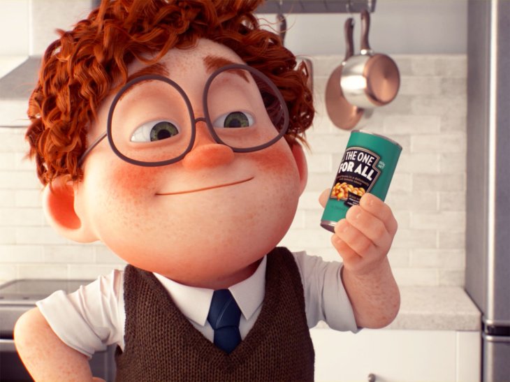
Brilliant branded content: Geoff the Film from Heinz Australia

can-size-for-every-aussie-ft-blog0917

Bravo to Heinz Australia, agency Y&R New Zealand, and studio Assembly Ltd. for this bit of genius.

If you haven’t seen Geoff the Film, take three minutes and watch it:

(if you’re like me, you’ll watch it a second time – it’s that good)

Firstly, this is a bold piece of filmmaking. Conventional wisdom is that a three minute running time is too long. The decision to tell the story with no dialogue and limited narration is risky, because it requires more attention from your audience. And taking a cinematic approach to a commercial is expensive.

Secondly, it’s executed brilliantly. The craftsmanship is superb, with lighting, music, character animation, editing, and production design simply spot-on. Omitting dialogue means that the character performances have to be evocative and nuanced, and the music cues have to be perfect, and the production teams deliver. It has all the technical quality of a film, of something a person would watch for sheer entertainment.

Finally, what an amazing approach to a rebrand! Heinz is a venerable brand, with generations of loyal consumers. It can be tricky for such an established product to make any changes at all without getting a lot of negative backlash. Most consumers won’t like the change and express suspicion that there has been a change in value along with the change in packaging.

But the storytelling construct of Geoff completely bypasses that kind of negative feedback by couching the rebrand in an emotionally compelling narrative. We like Geoff, we care about him, and, through the course of the spot, we learn:

  • Geoff loves beans as much as we do
  • Geoff has to solve specific practical problems for his situation
  • Each new iteration of can is an innovation for the problems that Geoff has, moving him closer toward happiness

Geoff makes the case for the rebrand emotionally, and does it in a more compelling way than any talking head would do. It’s an absolutely perfect solution, because people’s attachment to the old branding is an emotional one as well: this isn’t about the product, it’s about the nostalgia. Heinz personifies these impulses and creates a new story with just as much emotional relevance. Incredibly clever.

In terms of investment, creating the three minute film and then an assortment of :15s really maximizes the media buy. The film is watchable and sharable and delightful; the :15s simply recall it to mind and re-state the targeted marketing message.

This film exudes the classic charm of an animated film, while simultaneously accomplishing a complex marketing maneuver. Its deceptively simple appeal makes it a brilliant piece of branded content.